
asignua / filament-toggle-icon-column

A clickable icon column that toggles a boolean in place for Filament 5 tables and relation managers: the successor of archilex/filament-toggle-icon-column.
Package info
github.com/asignua/filament-toggle-icon-column
pkg:composer/asignua/filament-toggle-icon-column
Requires
- php: ^8.3
- filament/filament: ^5.0
- illuminate/contracts: ^12.0|^13.0
- spatie/laravel-package-tools: ^1.16
Requires (Dev)
- larastan/larastan: ^3.0
- laravel/pint: ^1.18
- orchestra/testbench: ^10.0|^11.0
- phpunit/phpunit: ^11.5|^12.0
Suggests
None
Provides
None
Conflicts
None
Replaces
None
README
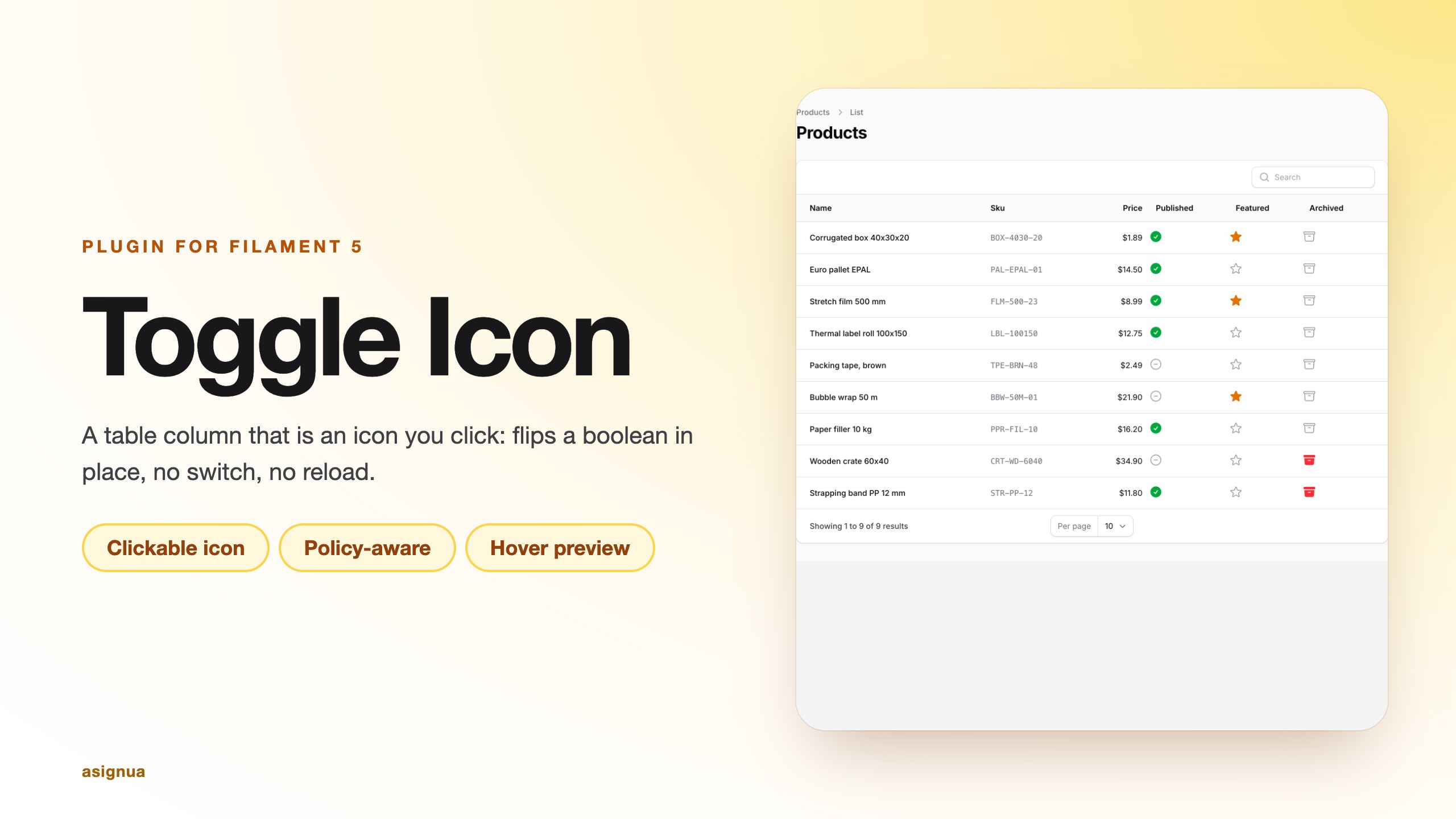
A table column that is an icon you click: it flips a boolean attribute in place, with no switch and no page reload. The Filament 5
successor of archilex/filament-toggle-icon-column (which stopped at Filament 3).
Filament core has ToggleColumn (a switch) and IconColumn (read-only), but nothing that is an editable icon. This column adds
the missing piece and keeps the core saving contract: validation, beforeStateUpdated/afterStateUpdated, disabled(),
and, unlike the core editable columns, a model-policy check.
Screenshots
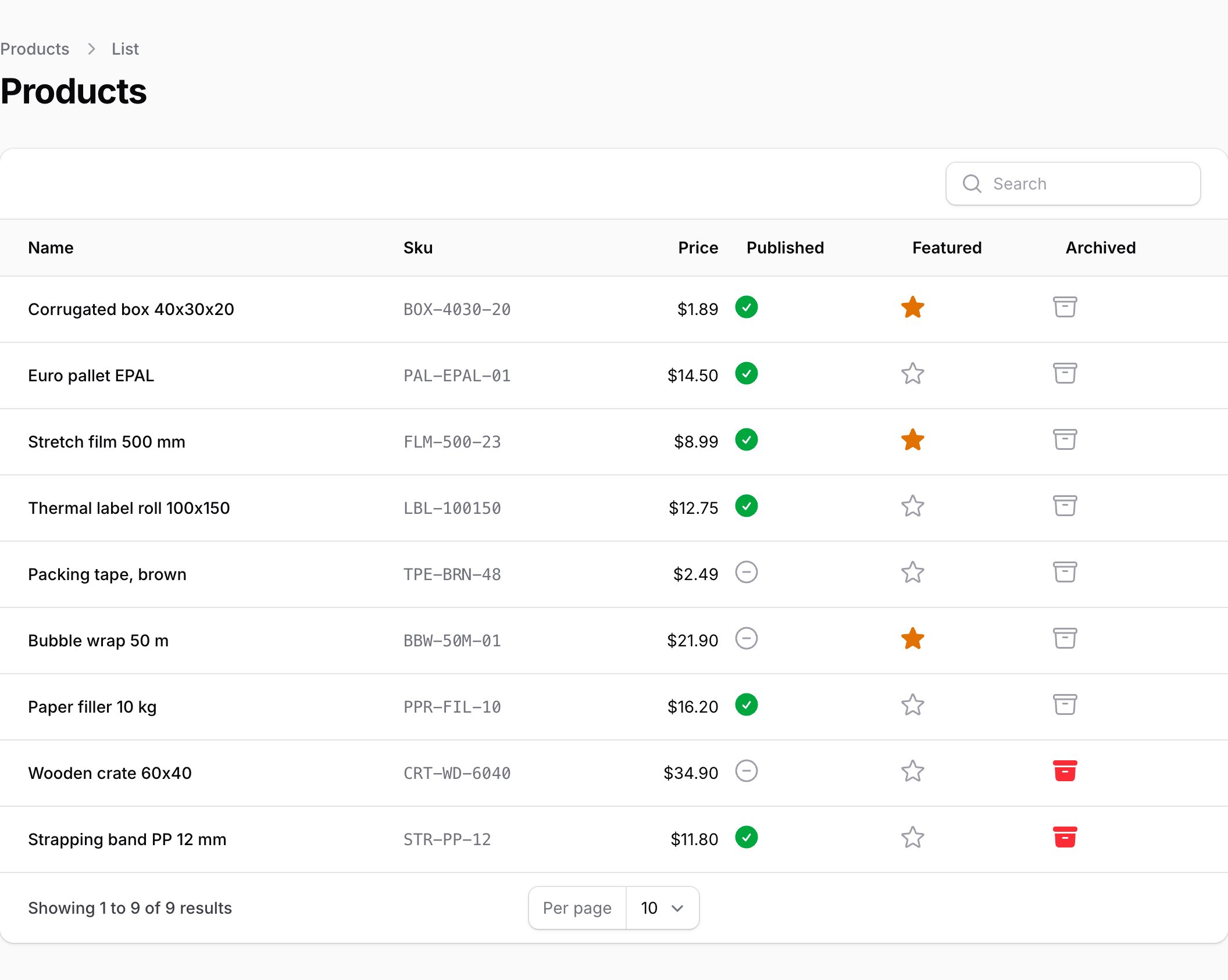
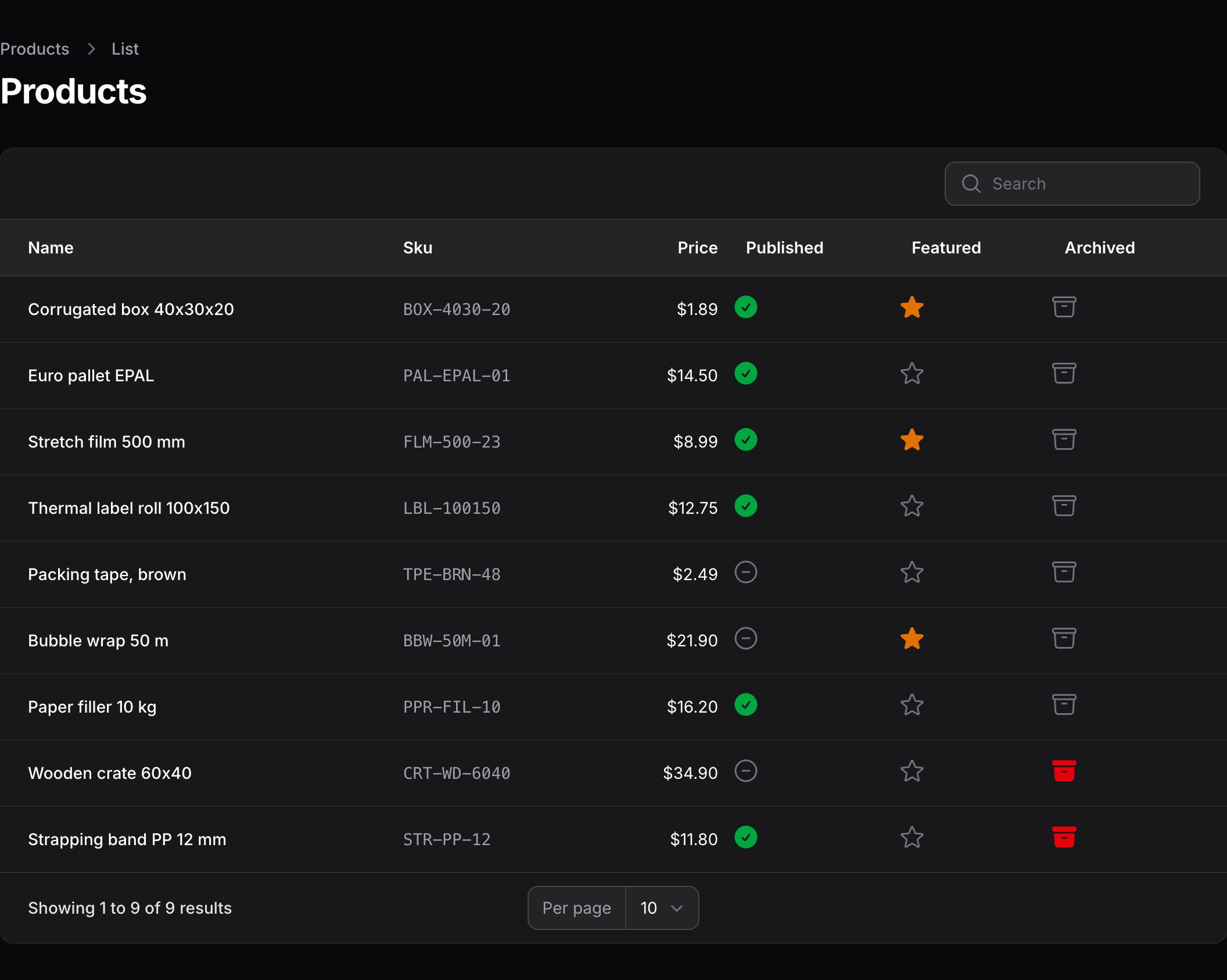
The column renders as a single clickable icon in the table cell (check-circle / x-circle by default), in light and dark mode:
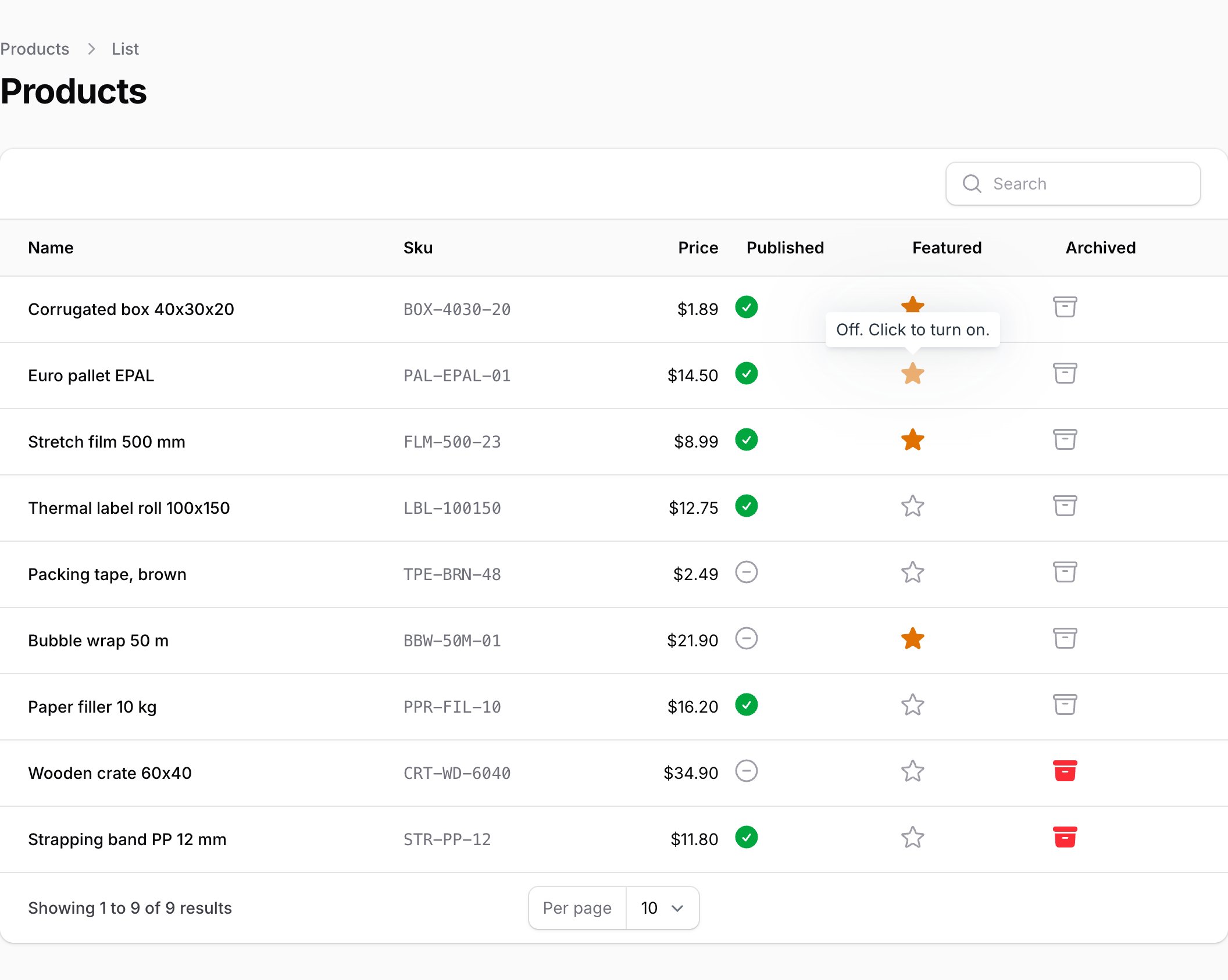
Hovering an enabled icon previews the state the click would produce:
Requirements
- PHP 8.3+
- Laravel 12 or 13
- Filament 5
Installation
composer require asignua/filament-toggle-icon-column
php artisan filament:assets
filament:assets publishes the small stylesheet that colours the icons (onColor(), offColor(), hoverColor()). The column is a plain class and needs no registration. Registering ToggleIconColumnPlugin::make() on a panel is optional and only
marks the plugin as installed.
Usage
use Asignua\FilamentToggleIconColumn\Columns\ToggleIconColumn;
use Filament\Support\Enums\IconSize;

ToggleIconColumn::make('is_active')
    ->onIcon('heroicon-s-check-circle')
    ->offIcon('heroicon-o-x-circle')
    ->onColor('success')
    ->offColor('gray')
    ->size(IconSize::Large)
    ->tooltip('Toggle active'),
It works in resource tables and in relation managers (both use Filament's updateTableColumnState()).
Saving, validation and hooks
Same API as ToggleColumn:
ToggleIconColumn::make('is_published')
    ->rules(['boolean'])                                  // default; an error shows in the tooltip and the icon reverts
    ->beforeStateUpdated(fn (Post $record, bool $state) => ...)
    ->afterStateUpdated(fn (Post $record, bool $state) => ...)
    ->updateStateUsing(fn (Post $record, bool $state) => $record->publish($state));  // replaces the default write
Disabling and authorization
->disabled(fn (Post $record): bool => $record->is_archived)   // greyed out, and the server refuses to write
->authorize()            // default: Gate `update` on the record, only when the model has a policy
->authorize('publish')   // another ability
->authorize(false)       // skip the policy check (core ToggleColumn behaviour)
->authorize(fn (Task $record): bool => ! $record->is_locked)  // closure gate: false denies, true allows (the policy is not asked)
->authorize(fn (): string => 'publish')                       // closure returning a string: the ability to check
Core's editable columns only honour disabled(); this column also asks the policy, so a user who may not edit the record cannot
flip it by crafting a Livewire call. The policy of every record the write touches is asked: the row, the related record for a
relationship column (user.is_active), and a pivot that has its own policy. Semantics are Filament's own
(get_authorization_response()): a model without a policy stays editable, a policy without the method allows, and the panel's
strictAuthorization() is honoured (it throws for a missing policy).
Hover hint
By default, hovering (or focusing) an enabled icon previews the state the click would produce: the opposite icon, dimmed.
Turn it off with ->hoverHint(false); ->hoverColor('warning') recolours the previewed icon. On a cell that cannot be clicked the
state tooltip only reports the state. ->stateTooltip() adds a translated tooltip ("On. Click to turn off.") when you set none.
Accessibility
The icon is a role="button" with aria-pressed, aria-label (the column label), aria-disabled, aria-busy and aria-invalid;
Enter and Space toggle it, and disabled icons leave the tab order.
Configuration
There is no config file; everything is a fluent setter on the column (see Usage). size() (an IconSize or 'xs'...'2xl'), hoverColor(), hoverHint(), authorize() and
stateTooltip() are the additions over the core editable column API.
Gotchas
- Rules as an array.
rules(['boolean', 'accepted']), never a pipe string. - Alpine CSP build is not supported: the column's client logic is an inline
x-dataobject. - Row URL / record action. Clicks on the icon never reach the row action (
disabledClick()is on); the rest of the cell does. updateStateUsing()replaces the write, including for JSON paths such assettings.flag; the default write handles those itself.- Policy without
update. As in Filament resources, a policy that lacks the method allows the write (deny it explicitly in the policy; strict mode throws instead).
Translations
The interface ships in English, Ukrainian, German, Spanish, French, Italian, Dutch, Polish, Brazilian Portuguese and Turkish
under the filament-toggle-icon-column::filament-toggle-icon-column namespace. A test keeps every language in step with the English keys. Override a
string by publishing the translations (--tag=filament-toggle-icon-column-translations) and editing the copy in
lang/vendor/filament-toggle-icon-column.
AI agents
The package ships Laravel Boost guidelines (resources/boost/guidelines/core.blade.php) so a
coding agent wires it up correctly.
Testing
composer install
vendor/bin/phpunit
vendor/bin/phpstan analyse --memory-limit=1G
vendor/bin/pint --test
Changelog
See CHANGELOG.md.
License
The MIT License (MIT). See LICENSE.md.
Migrating from archilex/filament-toggle-icon-column
onIcon(), offIcon(), onColor(), offColor(), size('xl') and hoverColor() keep their names. Saving follows Filament 5's
editable-column contract (updateStateUsing, beforeStateUpdated, afterStateUpdated, rules). New here: authorize(),
hoverHint(), stateTooltip().